Measuring the Delightfulness of your UX
What is delightful UX?
Delightful UX is a user experience that literally puts a smile on your face (or an inner smile, if you’re not the type to show emotion easily 😉) simply because the interaction brings you joy. Feelings matter, and creating a positive emotional reaction influences the user’s behaviour and opinion towards the digital product they are using.
Delightful UX is literally the “cherry 🍒 on the cake” but only if the cake is yummy. If the cake itself falls short of the user’s needs and expectations, the cherry will not make up for it. This is expressed very nicely in Aaron Walter’s hierarchy of user needs, which is based on Maslow’s hierarchy of needs.
[Short excerpt on Maslow: Maslow suggested that before a human being’s higher needs, such as their esteem or self-actualisation needs, could be satisfied or even before the motivation to satisfy these higher needs would be kindled, the baser needs such as physiological and safety needs, first have to be satiated.]
Walter remaps Maslow’s hierarchy of needs to the needs of users. He defines the most basic need a user has as functionality, followed by reliability, usability and then pleasure. Taking an app to purchase train tickets as an example: a user’s first need would be that the app does just that: allow the user to buy a train ticket (= functionality). The next need the user would have is that the app is reliable i.e. the data it provides is accurate, the payment is secure etc. and once these needs are met, the user will look for usability. Was it onerous to buy that ticket, or did the app make it seem effortless because it was so intuitive? Each of these needs is a potential exit for the user and a reorientation versus another app that might satisfy their needs better. And only once all of these needs are met, the user will appreciate if the app is pleasurable.
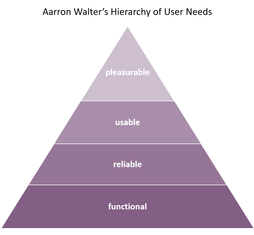
Aarron Walters Hierarchy of User Needs
“Designers creating interfaces that are just usable is like a chef creating food that’s just edible.” – Aaron Walter
How do you create delightful experiences?
So … knowing all this, how do you go about building a delightful experience?
First and foremost, you must ensure that the first 3 hierarchy levels of users’ needs have been satisfied, i.e. the experience should function reliably and as expected and be intuitive to use. Only then, can you add elements of deep delight.
“After all, no one’s ever said, “I’m thrilled this beautiful product doesn’t work as well as I expected.”” Nielsen Norman Group
Secondly, you need to understand your target user; what is their motivation in completing this task (other than the obvious: they want to complete the task 😉); what are their problems, how can their individual journey influence their experience. Being able to slip into their role will enable you to better empathise with them during their journey.
And, from here on, it’s easy-peasy:
- Walk through the journey, identify potential for strong emotions such as frustration, anxiety, panic or joy and address these.
- Anticipate your users’ needs, remove obstacles and think ahead for them.
- Pay attention to details.
- Review your users’ first impression and endpoints (error pages, process stops etc).
The elements that can produce delight may be:
- an animation such as the loading icon in this banking app which aptly and cutely visualises a vault being opened
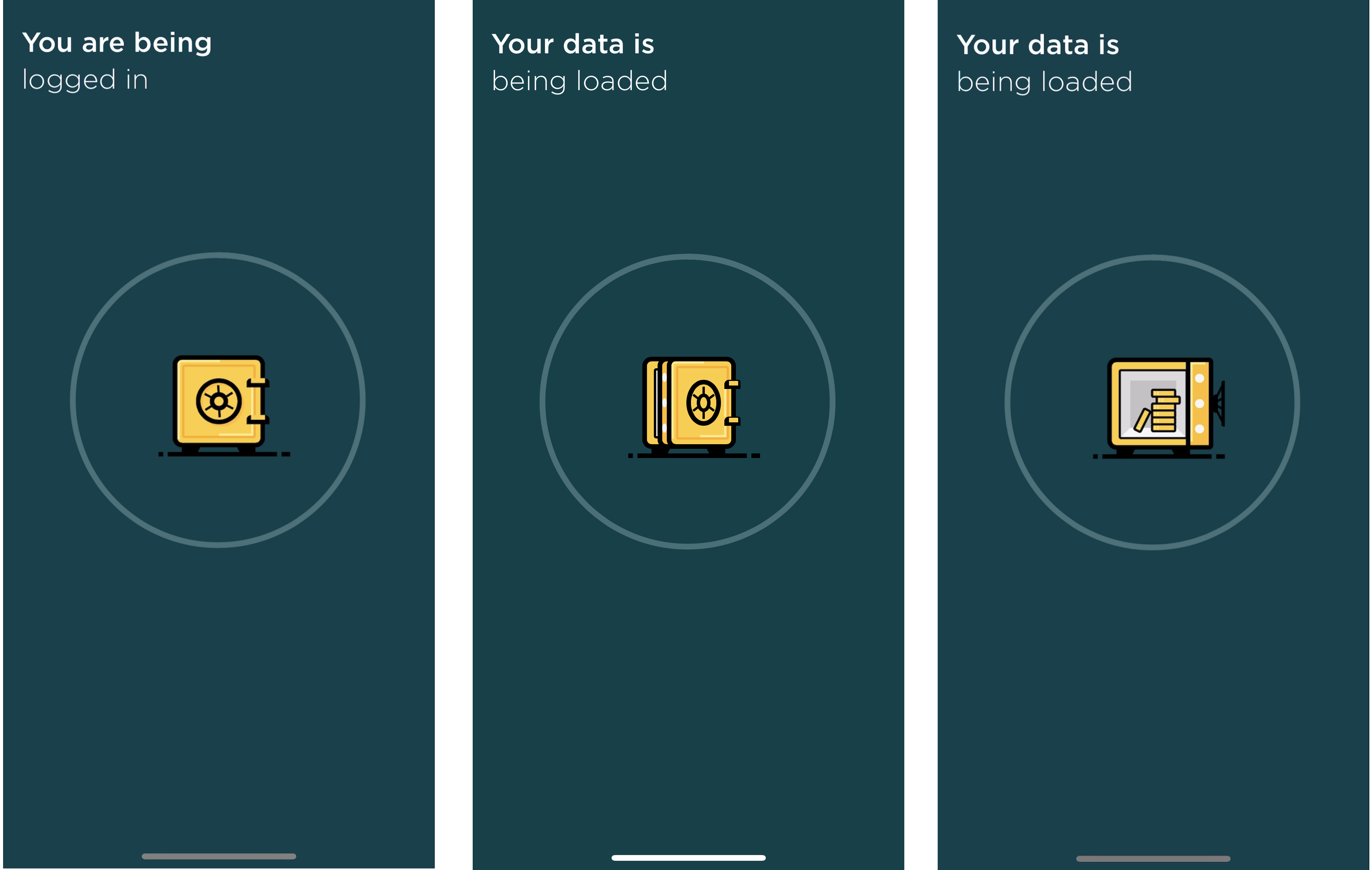
Loading icon of the Commerzbank app
- unexpected or surprising copy such as this little guy’s response to whether he is human. I know it’s tapping into conversation design but it is unexpected and adorable.
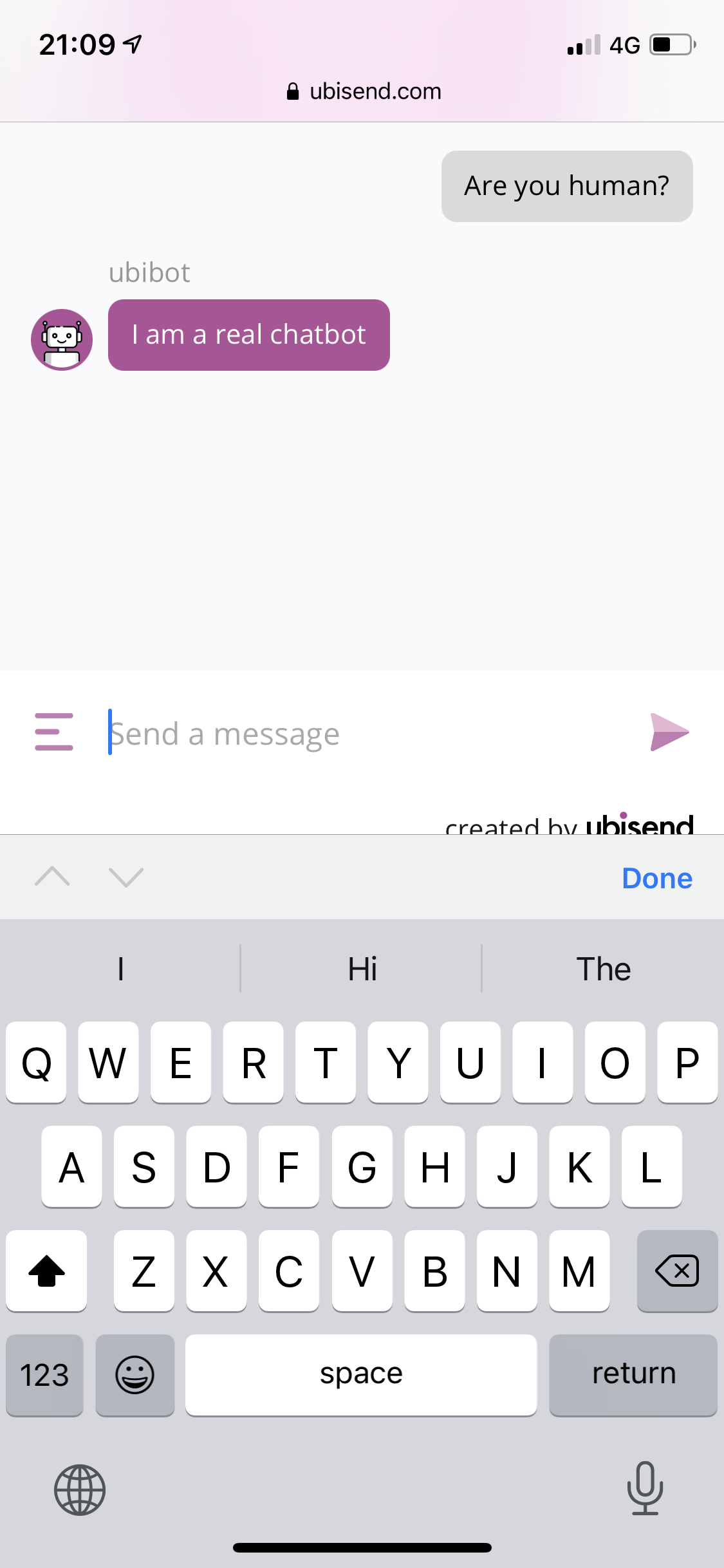
Chatbot’s response to whether it is human
- beautiful, relevant imagery such as Tesla’s connected car app which displays the actual model of the car with its actual colour (surprisingly still not all connected car apps do this) and its current status (doors open/closed, car connected etc.). And it also has a little animation to show that the car is charging. You can literally see the green current moving into the car.
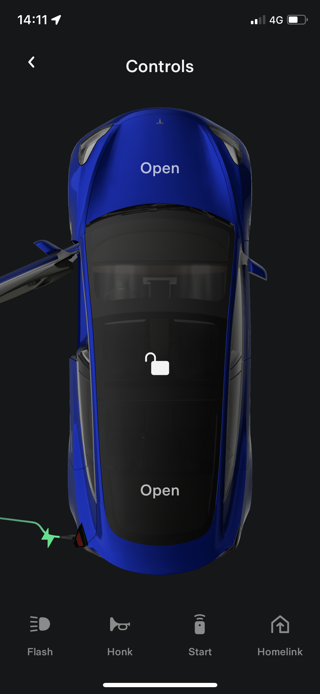
Car status in the Tesla App
- personalisation such as that time when you could find Coca-Cola bottles or Nutella jars with your name on them in the supermarkets (for those who had a name Coca-Cola or Nutella thought ubiquitous enough to use 😉).
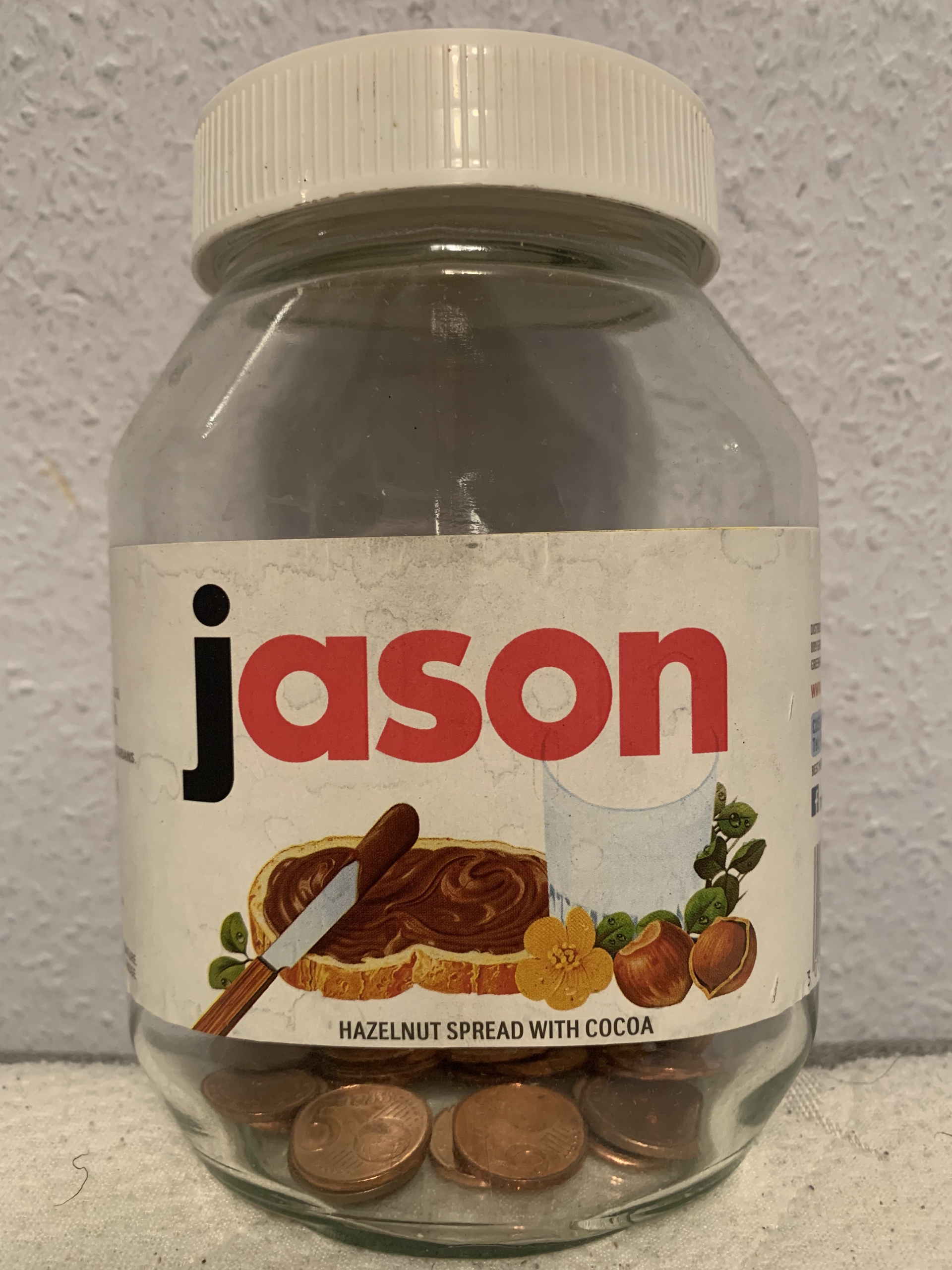
Personalised Nutella jar
- little big details. The Rolex.com store locator page opens with a big, very visual map but also provides a nudge for users using screen readers to switch to a list version of the store locator.
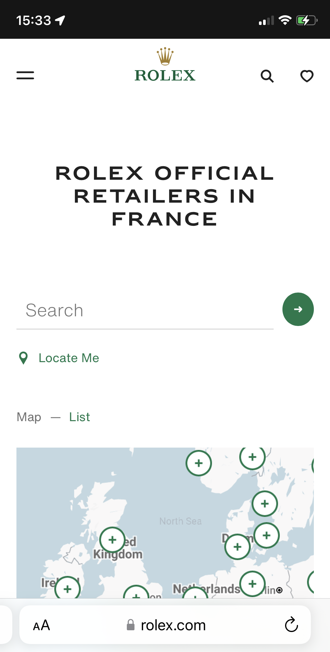
The Store locator page on Rolex.com
- Tactile feedback and gestural commands such as mass selecting emails in the iOS Mail app simply by dragging your finger across all the emails you want to select as opposed to selecting them individually.
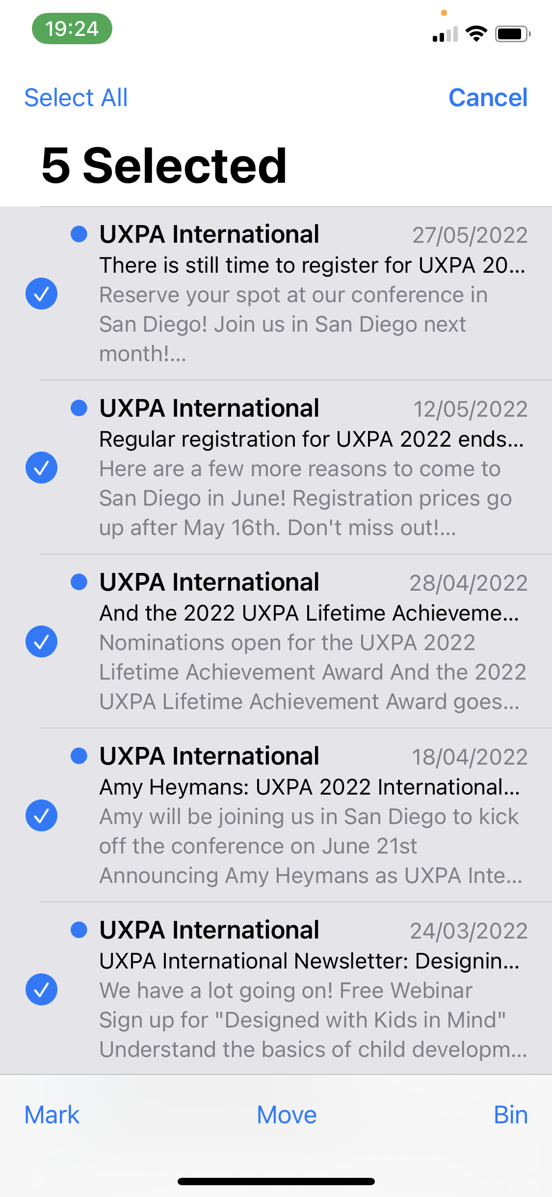
Multiselect of emails with drag and drop
- (subtle) interaction sounds such as a check* sound when checking off items on a grocery list.
When should you use delightful elements?
Delightfulness has to be dosed with care. A very considerate feature like the nudge for screen readers to use a list instead of a map is also useful and can thus be repeated every time the user accesses the page. A funny error message may not be perceived as fun, however, if the user has just lost all their data, and cheeky text such as “You’re a superhero!” can become annoying and lose credibility if displayed every time the user completes a task successfully.
As a rule of thumb, delightful elements can be used:
- when they are functional as well as being delightful
- in interactions that users will typically only see once (or not very regularly) such as onboarding journeys
- for adding zest to empty states and placeholders
Be cautious when using delightful elements:
- in interactions that users will typically see often. At the very least ensure that the elements used vary e.g. the microcopy rotates through a library of values. But even these could feel repetitive after some time.
- on error pages/in error messages. Be conscious of what might have led to the error and use elements that are appropriate in multiple contexts e.g. don’t write playful or cheeky error messages for severe errors.
How do you measure delightfulness?
Nielsen differentiates between surface and deep delight; surface delight being local and contextual, while deep delight is more holistic and the one we should aim to achieve.
You can measure the surface delight simply by asking users to rate how delighted they were on a 5-point (or 7-point) labelled (or non-labelled) scale. Similarly, you could use a Likert scale and ask users to rate how strongly they felt delighted. Any of these would correctly measure the level of delight the users felt. But it wouldn’t inform you how the other aspects of the experience were perceived.
The USERindex measures a users’ subjective user experience by evaluating the following 4 dimensions of their experience: Usefulness, Satisfaction, Ease of use and Reliability. These 4 dimensions map directly to Walter’s pyramid:
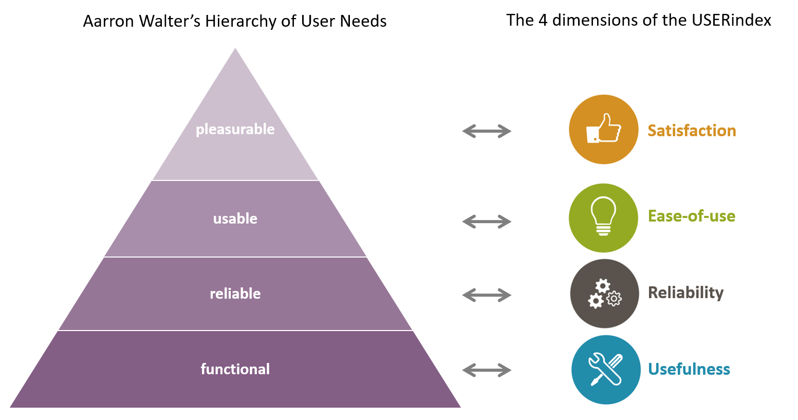
Mapping of Aaron Walters Hierarchy of User Needs to the 4 USERindex dimensions
The USERindex can thus be used to measure a product’s delightfulness as well as evaluate how the other 3 dimensions of the experience performed and identify on which level of the pyramid the product fails to live up to expectation. Try it out and do please share your thoughts!
*I have a very clear idea in my head of what a “check” sound would sound like.
Aaron Walter – Designing for emotion. http://www.abookapart.com/products/designing-for-emotion
Nielsen Norman Group – A Theory of User Delight: Why Usability Is the Foundation for Delightful Experiences https://www.nngroup.com/articles/theory-user-delight/